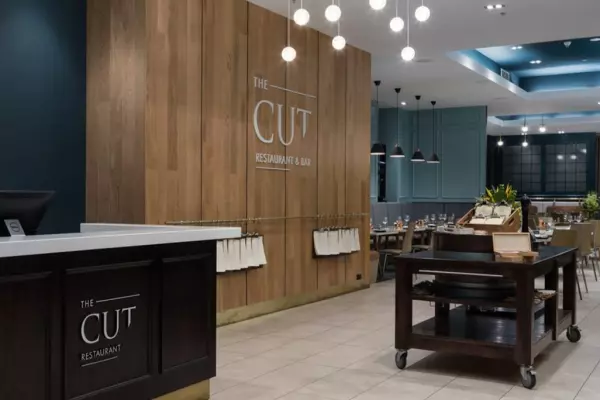
The trick to using colour is to first understand what you want from your space. Forget the classic Kiwi ideal that white will make a room bigger and brighter. You need to know what you, your employees and your customers want to feel.
An example: I once engaged the help of a top business mentor. This person had graced magazine covers and given talks that had inspired me.
Entering their office for our first session, I was taken aback by the decor. The walls were all white with a touch of grey, a combination so often used to make cutting in easy, as it covers well and hides mistakes, but always looks a little dirty.
The only colour was contained in red and black paintings and furniture, and it wasn’t a warm, creamy plum red or a burnt, earthy fox red, it was just primary colour, poster paint red.
I tried to focus and engage in the training and advice, but I wasn’t sold. I didn’t feel success or power in the space and I certainly didn’t feel productive or focused.
At the time, I considered my reaction a bit ridiculous. Now, knowing colours and how powerful the psychology around them is, I understand that subconsciously, many people would have experienced something similar, if slightly less dramatic.
So how do you use colour to create a powerful work environment?
Changing the temperature
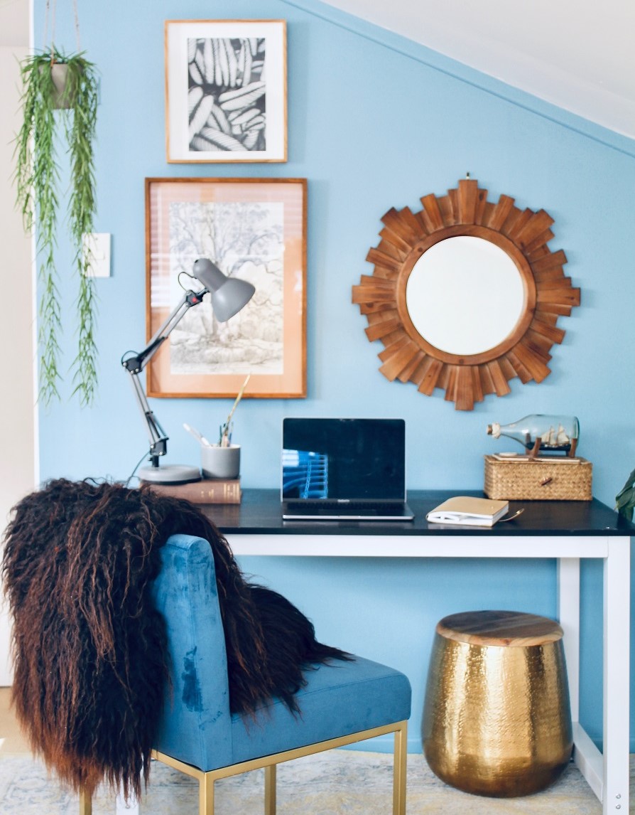
Using certain colours on the walls can change the perception of the temperature in the room.
Reds, yellows and oranges, even in pale, dusky and muted tones, instantly make a space feel warmer and more welcoming.
Cool colours such as blue, green and light purple will create a space that will register as colder, which can work well in hotter climates or in spaces which get a lot of sun.
Emotional rescue
Nothing will ever be textbook with humans – different cultures and backgrounds coupled with personal experience will influence an individual’s reaction to colour. There are some guidelines you can follow which are likely to conjure generalised emotions and responses, though.
Green is associated with creative energy and is linked to nature, regrowth and productivity. It’s thought to be restful on the eye and works well in spaces that don’t have optimal light or where employees are gazing at computer screens all day.
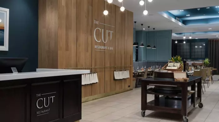
Blue is a colour favourite of many people and it links to positive signs in nature, such as clean water and clear blue sky, so it’s an effective choice for common spaces in work environments. Blue is thought to lower blood pressure and reduce stress, and studies have shown it can boost productivity.
Olive tones are the best choice for creating an environment that supports research, reading and studying.
White – the ever-popular choice – may not be doing quite what you think. Studies point to white invoking feelings of boredom and creating a lack of stimulation, leaving the mind of employees or potential customers to wander from the task at hand. It is also a highly reflective colour and has the potential to cause eye strain in certain work environments. Of course, the upside is that white is connected to feelings of sterility and cleanliness.
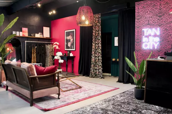
Red will invoke energy, stimulation and excitement, but it may induce those emotions in short-lived bursts. The downside is it can also make people restless and anxious, which is why it isn’t often used as a main colour in work environments. As a secondary colour, or as an accent colour, it can work well.
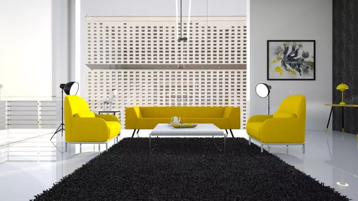
Yellow and orange in their brightest versions can over-stimulate and irritate – they are attention-grabbers – but used in lighter shades, yellow is pure sunshine, making people feel welcomed, and orange can create a feeling of good value.
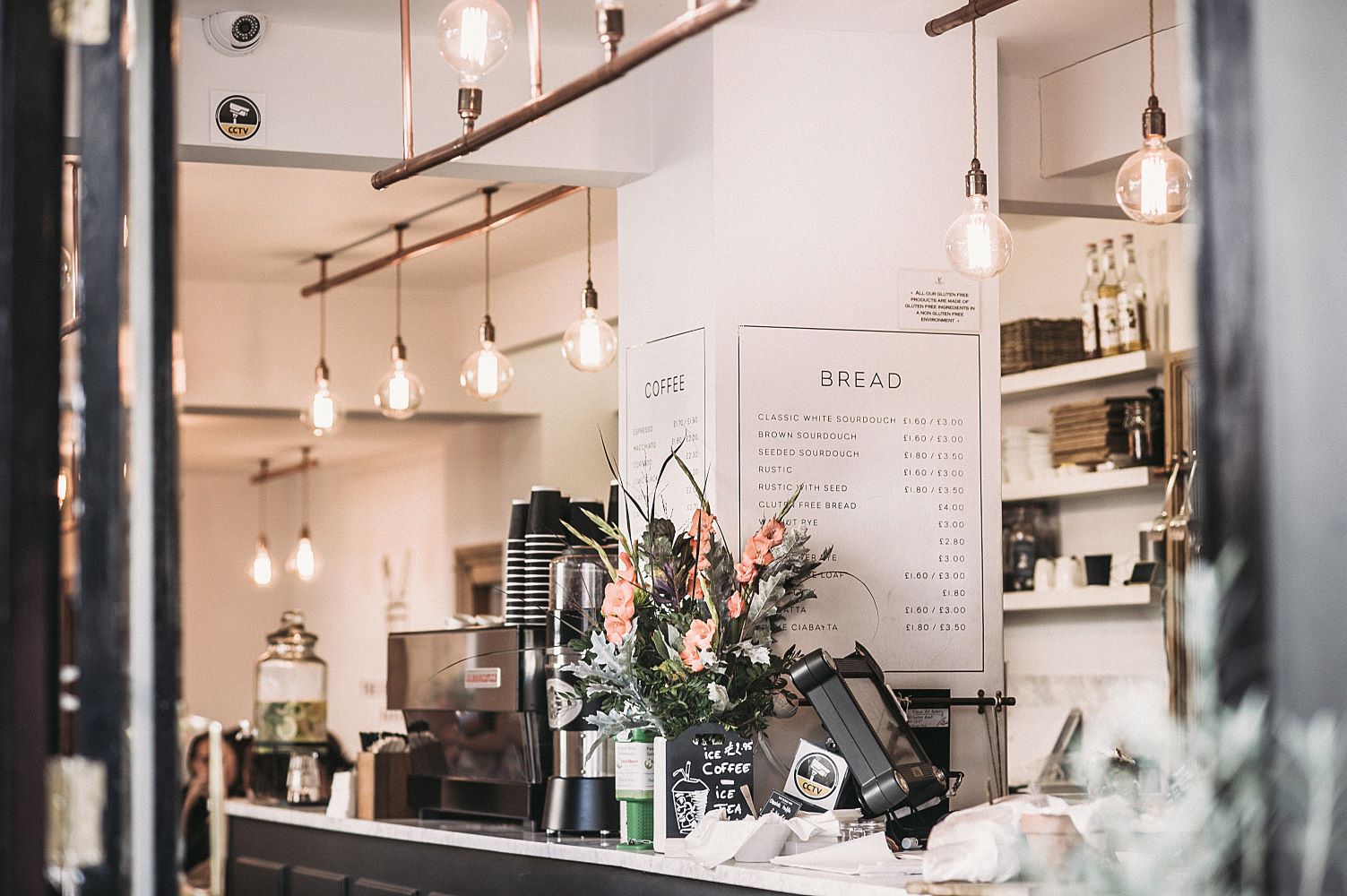
Pink is a good colour choice for creating a calm, casual and cosy space. It is recognised for creating a relaxed vibe.
Colour psychology is something I utilise daily in my practice and I find the best thing to keep in mind is that colour is easy to adapt and play with.
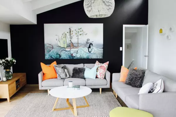
For example, if you must keep the walls white or you are creating a pop-up, invest in oversized artwork in the colours of your choice. If painting out an entire space feels too bold, play with a feature wall.
Begin with how you want your space to feel and choose colours accordingly. Colour should be used to inspire a sense of curiosity. Chances are your employees or customers will feel that positive energy, too.
Alison Ward is the founder of Corner Room Design in Auckland.


