Driving down Auckland’s Parnell Rise one afternoon pre-lockdown, I played my usual game, counting the number of empty stores with multiple “For Lease” signs in their windows. On this particular day, there were 15.
High streets and small businesses create a sense of community and bring people together to shop, browse, explore and discover.
Having eye-catching, well-kept windows is a massive plus for building owners. They help potential tenants to reimagine the space and feel inspired by the possibilities. For surrounding businesspeople, they lift the area and create a sense of progression and life.
Artistic displays delight and engage foot traffic – they’re a win for the whole community.
With these benefits in mind, some weeks later, when the country was in Alert Level 4, I met online with Parnell Business Association general manager Cheryl Adamson, and together we worked up a plan for design ideas with some building owners who were happy to participate.
My first day reinventing empty windows was a Sunday afternoon. I was building a framework in an empty storefront. The drizzly rain and glowing lights seemed to pique curiosity – people stopped to chat and share their thoughts and opinions. It occurred to me that we were all looking for the same thing, heightened by weeks in lockdown – a community that makes us feel safe and secure.
The concept for the first window was to envisage a store that carried upcycled, interesting and inexpensive furniture and homewares. The backdrop needed to feel timeless enough to adapt to change, allowing the window to be reinvented many times.
Getting my hands on materials proved tricky – the lockdown had only just been eased – so, instead of ordering wallpaper, I hand-painted a mural in the style of House of Hackney’s Bambusa print.
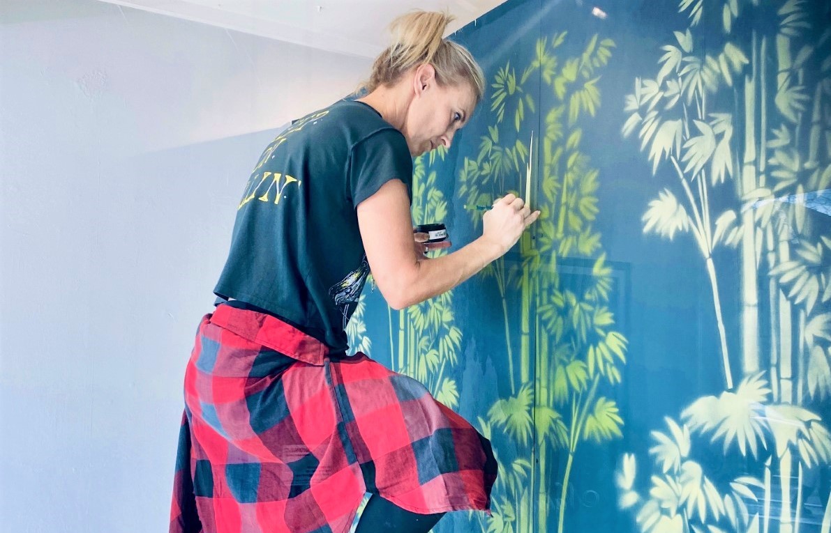 Designer Alison Ward creating a retail feature wall
I layered the scene with a freshly renovated canary-yellow armchair, palms and a unique second-hand book mobile I crafted by gently bending and gluing pages to form a floral effect. Locals took the time to stop and comment on how beautiful and eye-catching the window was and how they were excited to discover more.
As the second and third stores were unveiled, curiosity grew and community spirit felt lifted.
While we work hard to create an online presence for the survival of our businesses, we also need to make sure our web-based efforts connect back to our brick-and-mortar stores.
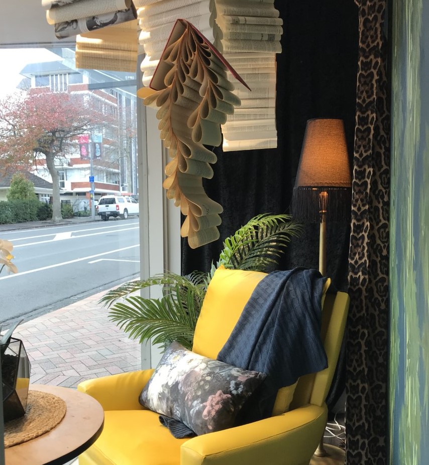 The finished Parnell Rise shop window
If you’re looking to create a killer window display, here’s how to get started, stand out and get noticed.
Define
Get to know your target audience, which may be changing with click-and-collect shopping options on the rise. Make sure your window speaks to your ideal customer and tells a story about your brand.
Theme
When conceptualising a window display, have a starting point such as colour or season to unify and send a clear message to your target audience. Picking a colour palette is best kept simple so it doesn’t distract from the product.
The scene
Create a scene to engage the imaginations of passers-by. For example, this can be a bedroom, beach, or a garden. Use some key props to create a frame for the space where your product will be.
Product
Select one key focal piece that “pops”, something that has a higher price point, is large or has a bold pattern or colour and stands out. Add only a few other products, perhaps ones that don’t sell so easily on the shelf and need a little space to be seen.
Layout
Make sure there are varying heights in your display to engage your audience and invite them to discover what’s on offer. Check out your window from all angles, including as it would be seen by people driving by. Make sure it stands out. Keep your product at eye level.
Lighting
This is key to highlighting your product and drawing people in. Keeping a window lit at night maximises your advertising time and means the display is easily seen from passing cars.
Change
Interesting, ever-changing windows or displays get noticed. Human nature dictates that we need change. Keeping things fresh gives people a sense of movement and progression. It piques curiosity and helps get potential buyers through the door to explore. If you’re on a budget, create a display that can be changed easily without having to start from scratch.
Alison Ward is the owner of Corner Room Design in Auckland.


