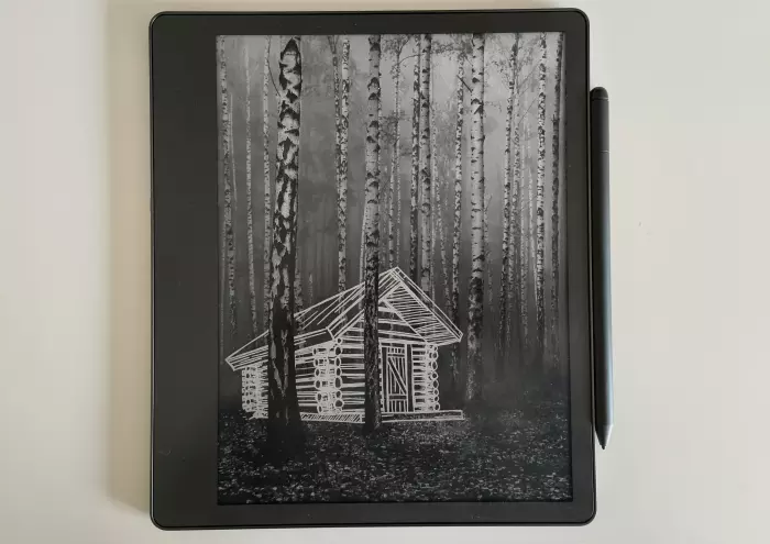
Amazon’s Kindle Scribe is genuinely a fascinating product – and not entirely in a good way.
The idea of a digital writing pad is not new. For years now, the Remarkable tablet has been the best-known name in this area, not least because of a very aggressive online marketing campaign.
However, it was the Kindle that brought e-ink and e-paper into the mainstream as it worked to create a reading experience that better replicated actual paper books.
Unlike a standard tablet, such as an iPad, e-readers are light to hold, easy on the eyes, and the battery lasts days or even weeks when not in use.
The tradeoff is there is no colour and they are not particularly responsive – not an issue when you’re mainly reading text.
An e-notebook uses similar tech but with the addition of advanced touch sensing and a stylus that allows you to take handwritten notes.
The Kindle Scribe is Amazon’s attempt to smoosh an e-reader and an e-notebook together, and the result is something that is good for both but not fantastic for either.
It retails for around $700, which is competitive with the Remarkable 2, but far above the $200-$300 for the reader-only Kindle models.
Reading
The first Kindle was released in 2007, a year after the Sony Reader, which was the first true e-ink e-reader.
Sixteen years later, it is no surprise that the reading part of the Kindle Scribe is where it is strongest.
All the usual features from the classic Kindle are there: highlights and note-taking and font customisation and so on.
The backlight is nice for reading in the dim or dark; it can auto-adjust based on ambience and even gets dimmer as your eyes adjust.
If you like reading on a Kindle, you’ll probably like this one.

You can set the font size and style of your choice, and the stylus is handily magnetised for when you want to highlight something. (Image: Ben Moore)
At 10.2in, the big screen could be a positive for you if you want more words on display at a time, but it also does make the device a little more unwieldy than the classic 6-7in standard.
But it’s still smaller than outsized editions of paperbacks and lightweight enough that the size isn't uncomfortable.
The extra width on the edge also gives a little more grip space to secure the Scribe in your hand.
All up, it’s fine, but lacks the portability and convenience of its smaller siblings.
But it’s not the reading part that you’re interested in, now is it?
Writing
I was genuinely surprised at how good the writing feels on the textured screen.
I used the Scribe several times during interviews and found it was good enough for note-taking, and I could email the notes right to myself or anyone else very quickly and easily.
The stylus and screen combination also offers basic pressure sensing on the "marker" tool for people who want to be more calligraphic or to sketch on the device. That's not a feature I found useful, but there must be people for whom it is.
But the experience isn’t perfect.
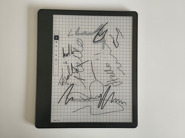
A sampling of the writing tools: pen, highlighter, marker, and fountain pen.
It is a little too smooth compared to paper – just enough that my ingrained way of writing was prone to weird errors as the stylus didn’t quite behave the way I am used to with a pen and paper.
With time, I imagine I would probably get used to it.
Another minor gripe is that if you have it positioned off-centre – say, if you have a book in front of you and the Scribe to your right – the gap between the actual display and the glass surface you're writing on means there's a slight gap between where the stylus tip sits and where you're writing.

If you write with the device off to your side, you can see the perspective issue, which is slightly off-putting. (Image: Ben Moore)
Together, this gives a kind of uncanny valley effect to writing on the device – it’s very close but just off enough that it doesn’t feel quite right.
That said, it was still good enough and far more convenient than paper and pen, and especially good for when you wanted to write on a many-paged PDF (caveat: see below).
Luckily, there is an "eraser" on the top of the stylus, which I frequently used.
The handwriting-to-text function might be good if you have neat handwriting and write small and tidily. Let’s just say I was the last in my class to get my pen licence and speak of this no more.
File management
Here is where the Kindle Scribe absolutely falls apart as being of any use to me.
I use Onedrive for work, iCloud for home, and Google Drive across both.
But none of that matters because the Kindle Scribe doesn’t sync with any of them.
If you want something on your device, you either have to send it to a special @kindle email address or upload it through Amazon’s portal.
I emailed a 7MB PDF to the Kindle address and it took four minutes before it showed up on the device.
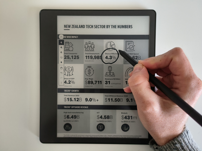
Annotating a PDF file is pretty smooth, but I hope you don't want it to be easily accessed. (Image: Ben Moore)
If I was speculating, I would say this is done because Amazon wants you to buy e-books from its own Kindle store and to prevent e-book piracy – which is fine for an e-reader, but absolutely a pain in the neck for an e-notebook.
If you have a few dozen PDFs you want to get on the device, it’s certainly possible, but it’s going to be a whole thing.
Apparently, you can export directly from Microsoft Word to the Scribe, although that didn’t seem to work for me at all. Even the promise of it only made me ask, why not Onedrive?
Final thoughts
There are other things I like about the Scribe, like being able to write on PDF and DOCX files, but there were some I didn’t like.
Take the touch navigation, for example: the back button is a weird mix of an arrow in the top left at times and an X in the top right at other times. Oh, for the iPad's five-finger pinch to return home.
Because it’s so light and replaces a book and a notebook, the Scribe has earned itself a coveted spot in my backpack.
But if I was out for an e-notebook, I just would not have gone with the Scribe when I know the Remarkable tablet integrates with OneDrive, Google Drive and Dropbox – especially not with the $700 pricetag.
If they get that sorted, though, I would happily recommend the Scribe for those on the lookout for something that offers a good balance between e-writing and e-reading.


