As a reviewer of many gadgets and a perennial nerd, I usually opt to have a high-end premium smartphone in my pocket.
I love the dinky size of the $1249 iPhone 13 mini but can’t help but tend towards the smoother, brighter, bigger display of the $1799 iPhone 13 Pro.
A normal phone will do fine, but I also love using the huge displays of folding phones if I get the chance.
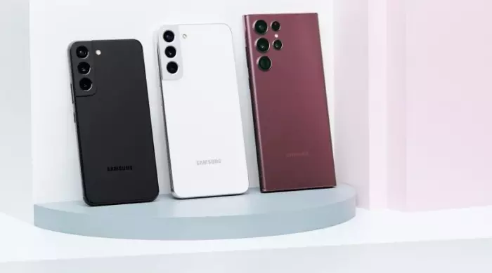
So, when Samsung sent me its new top-of-the-line Galaxy S22 Ultra ($1999), I expected to be smitten. But I am drawn more to the Galaxy S22, the smallest and cheapest ($1299) of Samsung’s three new S phones it also sent (I have not tested the middle child, the S22 Plus).
For many years, Samsung has released two or three Galaxy S phones at this time of year, followed by a Galaxy Note six months later. The Note was essentially an S phone but with a squarer design and slot for a stylus to write, tap, and draw on the display with.
But last year, Samsung leant hard into its new folding phone launch in Q3 and didn’t release a Note.
Now, the Korean tech giant has decided to bring back the Note in the S line but not call it that (keeping up?). The Galaxy S22 Ultra, as it is now called, takes the Note’s boxy design of the past and brings back the stylus, which Samsung dubs the S Pen.
The Ultra is too big and simply too much phone for me to really need or to enjoy using daily. It crowds my hands and leaves big dents in my jean pockets.
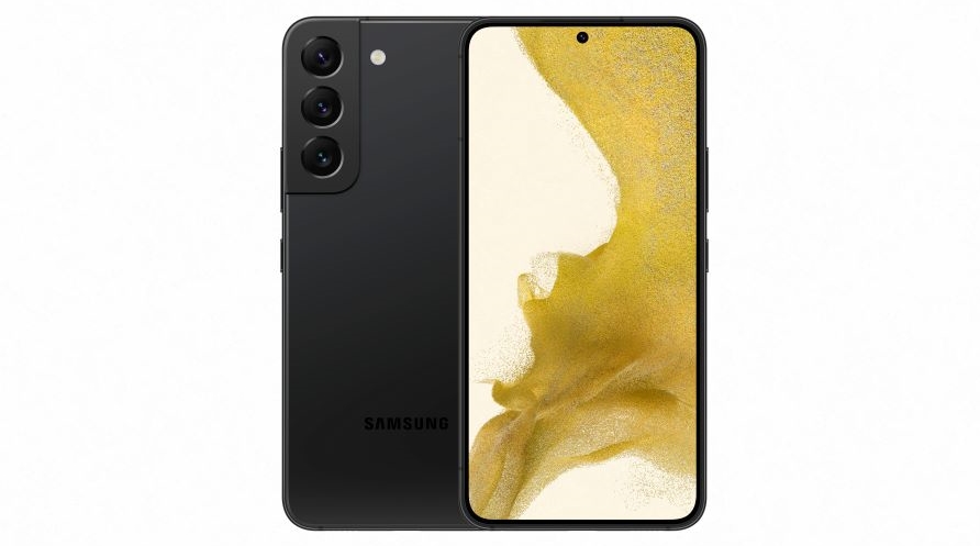 The small but mighty S22 model.
Sign of the times
Signing documents is handy with the S Pen but taking written notes of useful length simply isn’t possible on a screen this small. I find I can scrawl only three or four words before running out of space, particularly if the phone isn’t flat on a table. Note-taking with a stylus is still best on a tablet with a notebook-sized display.
Then again, BusinessDesk managing editor Pattrick Smellie owns the Galaxy Note 10 Plus, Samsung’s Note phone with a stylus from 2019, and tells me he regularly takes notes all the time for work and play. So, what do I know?
On the S22 Ultra you can also use the S Pen’s one button as a remote shutter button for the camera app or as a mini wand to navigate around certain apps without touching the screen. Just as on previous Notes, these are fun but ultimately gimmicky features. The same actions can be done more quickly if you just touch the screen.
Aside from note-taking, the S Pen is best used for signing documents, a very business-focused feature. Smellie says he’s never thought of this. So, what does he know?
Samsung also builds its DeX software into the Ultra (and normal S22), which, when plugged via USB-C into a compatible monitor, displays a desktop-style operating system. When paired with a mouse and keyboard, you can access and use your phone’s apps as you would with a desktop PC. It’s another superb business feature and a great differentiator for Samsung in the phone market that it barely talks about.
Most people don’t know DeX is there, but I think it’s one of the range’s best features. It would be possible for businesses to give everyone a Samsung phone and then kit out offices with monitor, keyboard, and mouse terminals for hotdesking with just a phone. No need for a computer. HotDeXing!
Small gains
Unlike last year’s S21 range, which all shared the same design language, the big Ultra now looks completely different from the S22.
No smartphone is truly compact these days, but the 6.1-inch screen on the regular S22 I tested feels positively puny compared to the 6.8-inch screen and thick body of the S22 Ultra.
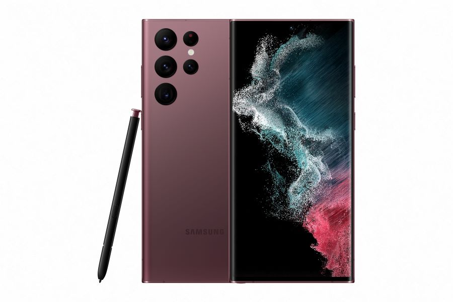 The S22 Ultra has one of the best displays on the market.
I much preferred the flat screen of the dinky S22 with its flat back, rounded corners, and slick-looking triple camera housing. The Ultra, on the other hand (and it takes two hands to do anything on it, such is its size), has a screen that curves down slightly at the left and right edge, which looks cool but serves no function. It perhaps makes the enormous phone feel nicer or easier to hold.
Both phones have lush displays with 120Hz refresh rates, a feature that means menus and apps appear smoother than most existing phones. Both also pack in wireless charging and 45W wired charging, which is quite fast, but there's no charger in the box, only a USB-C cable. Neither, as expected, has a headphone jack. The Ultra’s display is one of the best I’ve ever seen on a phone, with a higher brightness and resolution than the smaller S22.
The squared-off design of the Ultra has sharp corners and five cameras and sensors that seem to erupt from the back of the phone. Most camera bumps on phones look a bit daft, and this is minimalist design at its most stubborn.
Those cameras are very good, though, a sure advantage of the Ultra over its little sibling. It has 10x optical zoom, which means it uses the lens hardware to zoom in 10 times. The regular S22 can muster only 3x optical, the same as the iPhone 13 Pro. As usual, Samsung pumps up the saturation to make photos a little more Instagram-ready and a little less true to life, but I quite like how they look.
The Ultra flexes against the competition by being able to zoom in up to 100x using digital smarts. It means I could stand on top of Mt Eden in Auckland and take the photos at 1x and 100x zoom from the same spot.
 The S22 Ultra at 1x zoom. (Image: BusinessDesk)
 From the same spot at 100x zoom. (Image: BusinessDesk)
A cool show-off perhaps, but a bit pointless. Every photo at 100x zoom looks like a shoddy watercolour.
Power play
A phone of the Ultra’s size can pack in a big battery, and I found it lasted all day with no issue. A shame, then, that the smaller S22 really suffers with battery life, which meant I kept a keen eye on the percentage most days.
It never ran out on me but would regularly hit 20% earlier in the evening than I wanted. If you’re hitting the town, you’ll need to charge it beforehand.
I suppose I simply have phone fatigue. The S22 Ultra looks quite like the Galaxy Note 20 from 2020, and it’s also just as powerful as the S21 Ultra from last year. If you have either of those phones, you don’t need to buy this one.
People are rightly upgrading their phones less often because those from three or five years ago are still working great, and phone technology hasn’t had many quantum leaps forward in a few years. Samsung insists on toying with the design and features of its phones to tempt people to upgrade, whereas Apple will methodically iterate on the usual iPhone template.
The regular S22 is probably more important for Samsung as its flagship, entry-level S-series phone this year. It’s the same price as the iPhone 13 and in New Zealand is the default Android alternative to Apple’s smartphone. Save yourself some cash and plump for it over the Ultra, but just remember to keep it charged.


