I am one of those spoiled millennials who believes strongly in work/life balance and as a result, I roll with two phones – the work phone sitting idle (hopefully) on the counter on evenings and weekends.
In my personal life, I am all in on t-shirts and Apple but when I’m at work, I put on the button-down and bust out the Android.
Until now, I had mostly used Samsung phones and, if I’m honest, did not enjoy the experience very much at all.
Even the promise of the top of flagship models and folding phones failed to win me over.
But I think Oppo has proven with its Find N2 Flip that Android can be good, and it has done it with a $1,600 flip phone to boot.
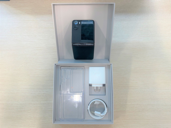
The Oppo phone comes with a three-year warranty as well as a 67W fast charger and cable, a clear plastic case, and pre-applied screen protectors, all in the box. (Image: BusinessDesk)
There’s a lot to say about this phone, so bear with me and I will get to why it is fantastic as a work phone specifically.
Specs
The specs are strong, if not extreme.
The 6.8in 1080p AMOLED ultrawide screen is nice, especially as it boasts a 120Hz refresh rate. Although it’s not mind-blowing, it is still very good.
The brightness level of 1600 nits is ideal for all but those situations where you are outside in sunlight and wearing sunglasses. Again, a very solid offering.
The phone has 8GB of RAM with the option to use part of the 256GB storage capacity to increase the RAM by up to another 8GB.
Performance, camera, connectivity – none of those things will disappoint you, but nor will they blow your mind.
And that’s not a bad thing, because unless you are a photography enthusiast, a phone gamer, or routinely do most of your work on your phone, it will do everything you need it to do and do it well.
But the best thing is the flip.
Nearing the ideal flip phone
Whenever people see me carrying the Find N2 Flip, they say, “Is that the new Samsung flip phone?” And without hesitation, I reply, “No, it’s better.”
“Oh really? Why,” they inevitably reply.
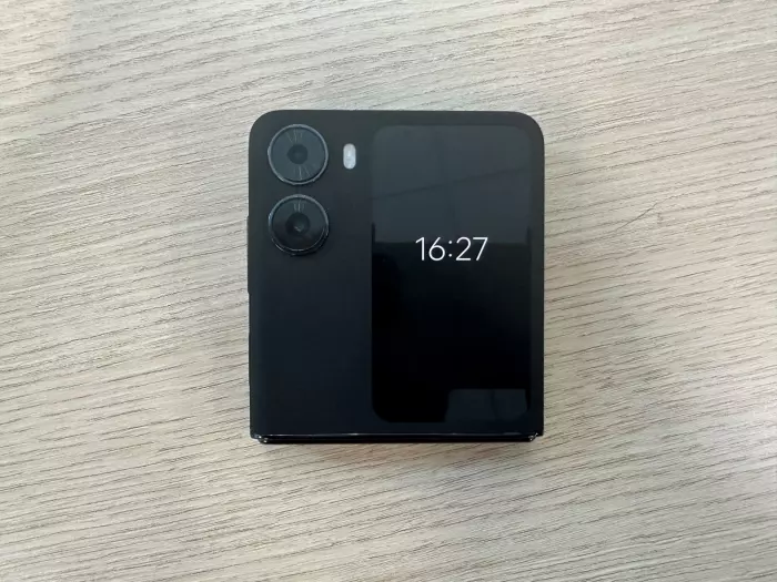
I hold up the phone, closed, edge facing my interviewer, and I say, “Look. It closes flush.”
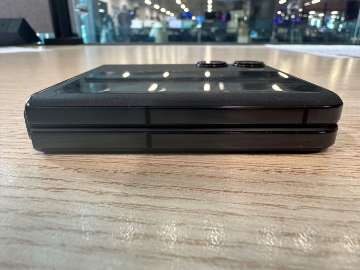
It closes flush! (Image: BusinessDesk)
There’s more to why I like this phone than just that, but there’s nothing I like more than that.
The gap in the Samsung and other flip smartphones on the hinge side is not just ugly, it’s impractical as pocket fluff and whatever else manages to find its way in there.
The fact that Oppo has produced a phone that closes flush like this is impressive, and it’s even more so when you look at the screen itself and see that the crease is barely visible during most usage.
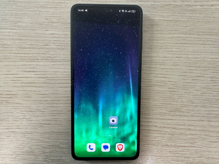
The crease is so minimal it's nearly invisible. (Image: BusinessDesk)
Oppo’s marketing material says the hinge is its superpower and, although I hate to say it, I actually agree with the marketing team on this one.
This is paying attention to user experience. This is the kind of design thinking that makes for a great phone; the kind of thinking that made the iPhone what it is today.
The Oppo Find N2 Flip delivers on the promise of what a flip smartphone should be, and the company offers a year where it will replace the screen if anything fails with it.
Design goods and bads
If there is one thing about the design I don’t like it is the texture of the front and back of the enclosure on the black model.
It feels smooth and soft to the touch, which is lovely until you remember you need to maintain a grip on your phone unless you want it tumbling to the hard, cold concrete below.
The rear bottom half probably has more things than necessary on it, which makes it look a little messy, and the camera on the front could be centred more with the sensor and flash placed differently.
But that’s me looking for something to criticise because while the aesthetic design isn’t amazing, it’s also not ugly. It’s a nice-looking phone.
Because it's on Android, you can also play with the design of the screen to your heart’s content to add the flair you like.
There are lots of other little things that are wonderful about the outer screen, like the widgets and the fact it can act like a viewfinder when you use the outward-facing camera.
Altogether, it may not redefine anything in general, but it has near-perfected the flip.
ColorOS
The phone uses Oppo’s own operating system overlay for Android called ColorOS, and it is brilliant.
With Samsung phones, I find that the Samsung overlay, One UI, and Android are at odds – they fight and shove over who gets to do what and it ends up feeling jumbled and messy.
ColorOS, no such problem. It knows when to step forward and offer value and when to step back and let Google take over.
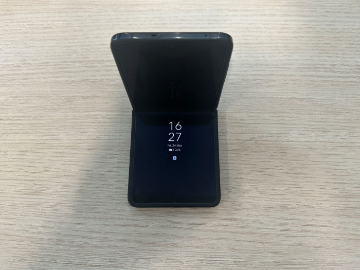
The hinge also sits at almost any angle without trying to snap open or closed but doesn't have too much resistance when you open it. (Image: BusinessDesk)
Where Samsung dumps your apps willy-nilly into a blancmange of a menu, ColorOS gives them to you alphabetised.
When you set up the phone, the Oppo asks if you want to use the pseudo buttons for home and back, or the gestures that iPhone users are familiar with and which makes using the phone so much more intuitive for me.
Oppo’s PR person said that ColorOS offered the perfect balance between iOS and raw Android and I smiled and nodded but internally scoffed.
But they were right.
Why it’s the best work phone
There is something in the psyche where, when you’re at a meeting, you want to have your phone in your pocket or screen down, but sometimes you also need to be aware of any really important notifications.
As a result, there is that awkward moment when you pull out your phone and check a notification and it feels like a real interruption of the meeting – whether a casual coffee or a management briefing.
With the nice big, clear front screen on the N2 Flip, you can quickly check the notification, and the tension of “are they about to ignore me to answer a message” is just gone because you know they are not, as the screen is closed.
This is what takes it from a good phone to a great one – not the specs, not the camera, not the screen, but the user experience.
It does it all and it does it very well.
And it’s a flip phone.


